

Designing a user-focused digital shopping experience
Herbalife is a global nutrition company focused on weight management, dietary supplements, and personal care products. Operating in 95 countries, the company generates approximately $5 billion in annual revenue through a network of 4.5 million independent distributors who both support customers and drive global growth.
Herbalife’s outdated digital platform created friction for both customers and distributors, leading many users to favor in-person purchasing over online experiences. At the same time, the brand’s visual identity and user experience no longer resonated with a younger, more modern audience, highlighting the need for a comprehensive redesign.
The objective was to develop an intuitive, user-centered platform that simplifies the purchasing journey, enhances the overall experience, and drives higher conversion rates.
Our team delivered a refreshed brand identity and e-commerce platform that created a seamless, intuitive shopping experience, driving a notable increase in user engagement. We also handed off a scalable design system featuring over 600 components to support long-term consistency and growth.
We began with extensive UX research to identify user pain points and uncover key opportunities for the MVP. This phase included audits, persona development, journey mapping, and analysis of best practices and emerging trends. These insights directly informed the next phase, enabling a more strategic and effective approach to wireframing.
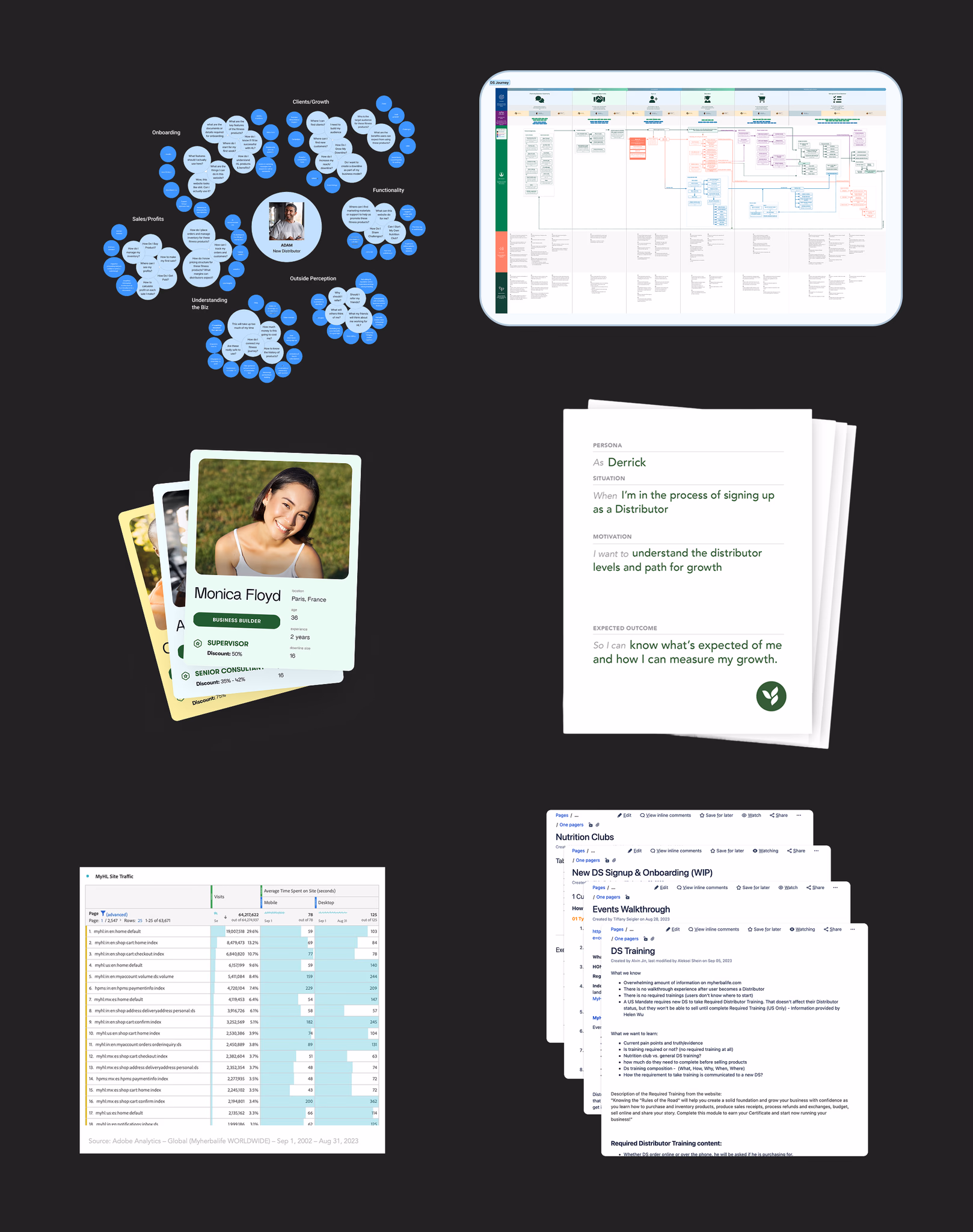
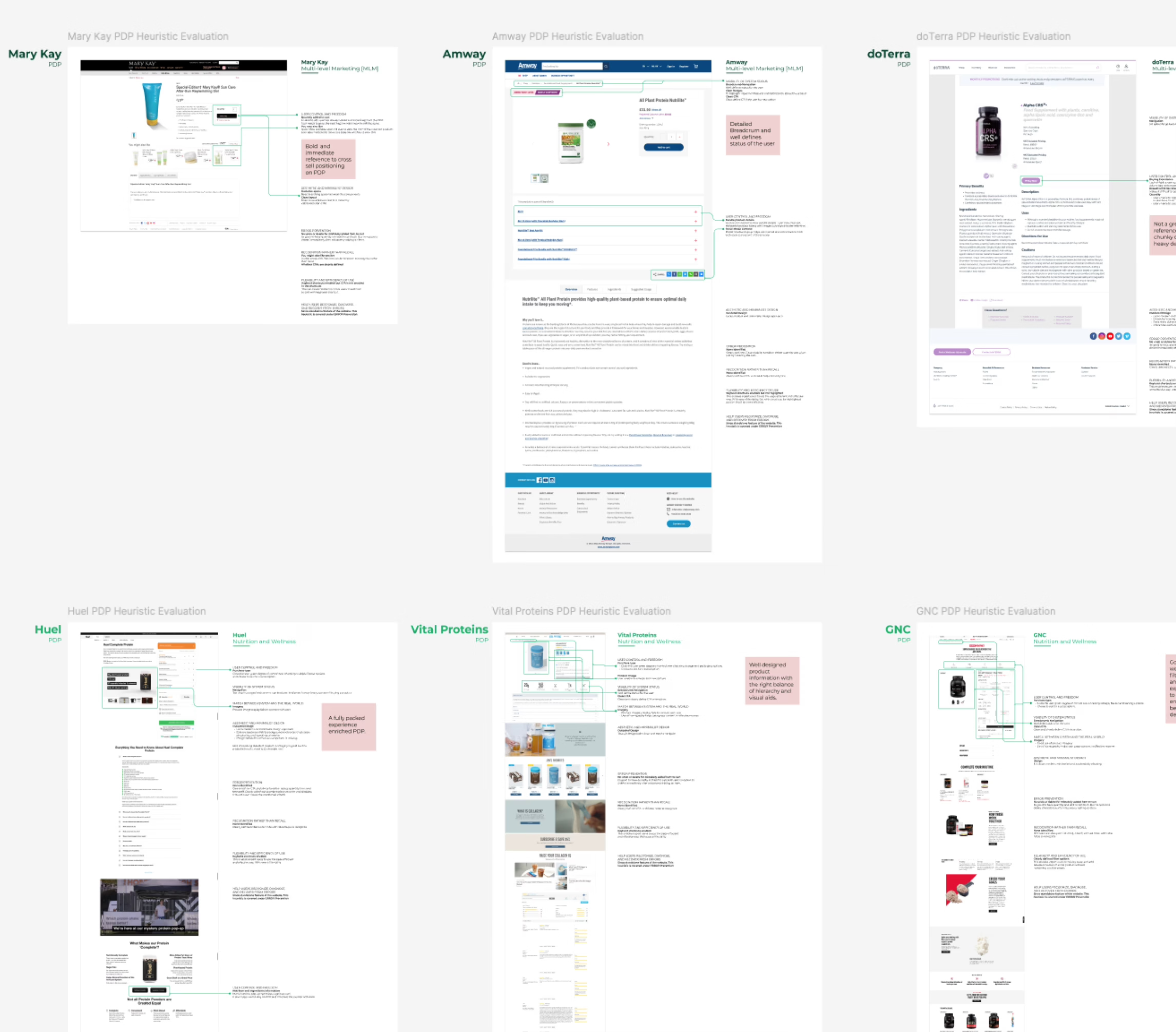
To benchmark opportunity areas, we evaluated nutrition and wellness platforms, supplement ecosystems, and direct-to-consumer health brands. These experiences delivered value through personalized product recommendations, subscription-based purchasing, and tailored content that supports individual health goals.
Research insights and user personas informed the development of information architecture and low-fidelity wireframes, establishing a clear and intuitive structure for the PDP. This foundation streamlined product discovery, improved accessibility, and created a more seamless path to conversion.

During detailed design, we brought the experience to life through high fidelity visuals, consistent components, and refined interactions ready for implementation.

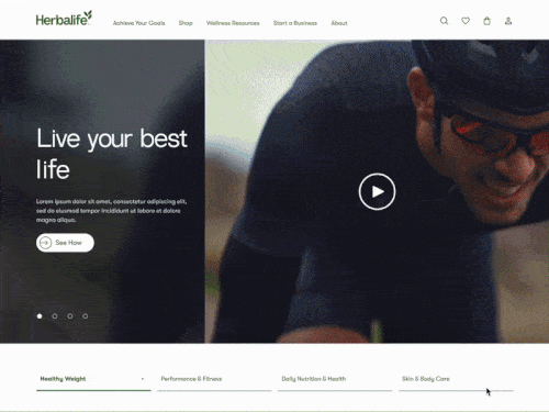
The rebrand introduced a refreshed homepage built around a clean, modern aesthetic with thoughtful use of color. The experience centers on the Herbalife community through health-driven messaging, authentic consumer imagery, a testimonial section that builds trust, and an article carousel that invites users to explore and stay engaged.
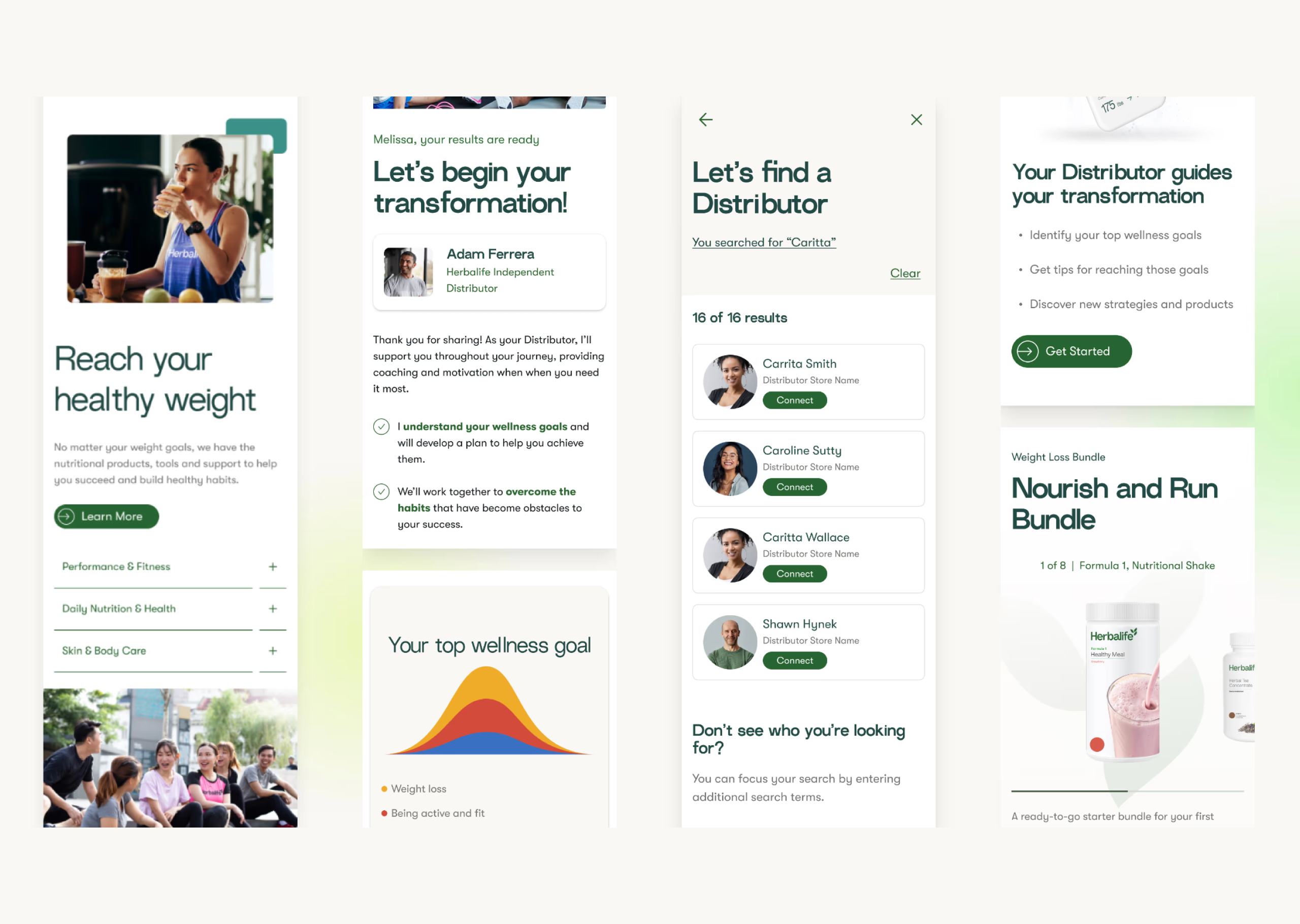
We streamlined the purchasing flow to make it as intuitive and frictionless as possible. Users move from the product listing page (PLP) to a product detail page (PDP), where they can easily select options such as flavors or variants through a dropdown and add items to their bag. The primary call to action remains accessible as a sticky footer once users scroll, ensuring it’s always within reach.
After adding an item, a flyout confirms the action and offers clear next steps, including checkout, viewing the bag, or exploring related products through a “People also bought” section. From the shopping bag, users can seamlessly proceed through checkout and complete their purchase.
Another path to purchase is through a distributor (DS), an independent seller of Herbalife products. Each distributor has a dedicated storefront where customers can browse products, make purchases, and engage with their content. These storefronts are created through the MyHerbalife platform, a backend tool that enables distributors to build and manage their own e-commerce experiences.
The account experience was designed for clarity and ease of use. By clicking the initials icon in the top right of the navigation, signed-in users are taken to a centralized dashboard with straightforward navigation across all sections.
Within this space, users can update personal information, manage security settings, edit saved addresses and payment methods, adjust communication preferences with distributors and corporate, and change their password, all in one place.
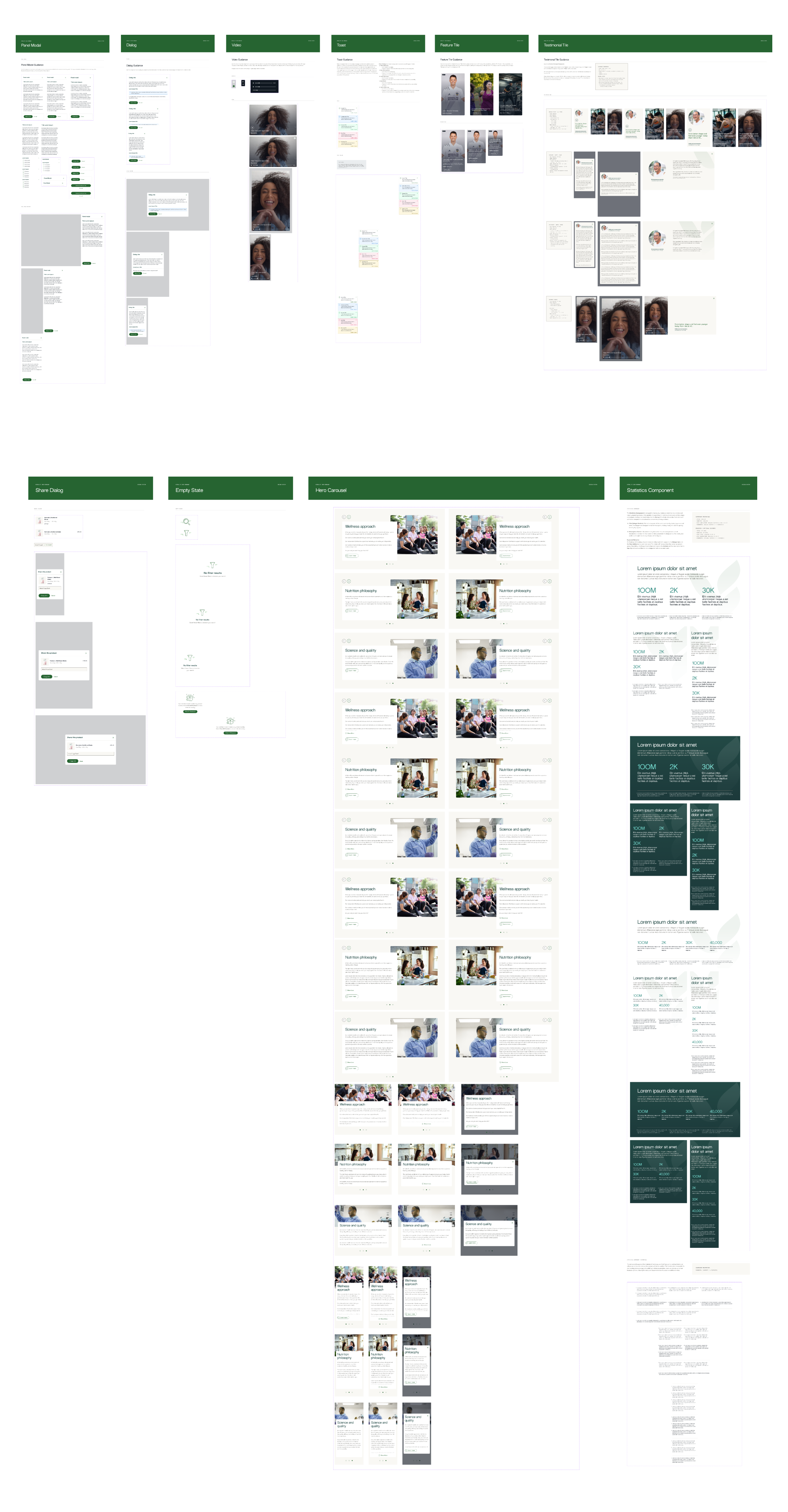
Our team developed the design system in Figma that evolved and modernized the existing visual identity. We expanded the system with updated typography, color palettes, CTAs, form elements, grids, badges, and modals. The focus was on creating a cohesive, polished experience that feels fresh while staying aligned with established brand guidelines.
Our team brought together a strong cross-functional group of creative directors, designers, copywriters, business analysts, and a product manager, all collaborating closely to ensure a cohesive and well-integrated experience.
I contributed throughout the entire lifecycle of the project, from early ideation through post-MVP design and ongoing visual maintenance. During this process, I developed a deeper focus on design system and library maintenance, which became a valuable area of growth.
Since launch, performance metrics reflect a meaningful improvement in the overall user experience. The following key indicators highlight the impact of our work.

